Role
initial ux +
ui designer
Platform
native
mobile app
Skils
research,
prototyping,
interface design
Introduction
Luckily, a freelance illustration client of mine had a project that needed to be worked on as another designer was too busy. Having previously talked about my moving to UX, he asked if I wanted to use the skills and knowledge I was learning to make a start on the app. This is that app. It's called Snack (Danish for chat), a language learning app that focuses on gaining knowledge through conversations with an AI.
The brief was to design an app that had only two main screens; a dashboard containing all of the users stats and streaks, and a conversation screen where the speaking would take place.
What I thought I knew before starting the project
As the brief mentioned, the app needed to be simple. Simple, I now know more than ever, is hard. There is a delicate balance between being simple and effective, and being dull. While I think I may be mostly there with this design there are far more nuances I need to learn to master keeping things simple.
Timeline
Research
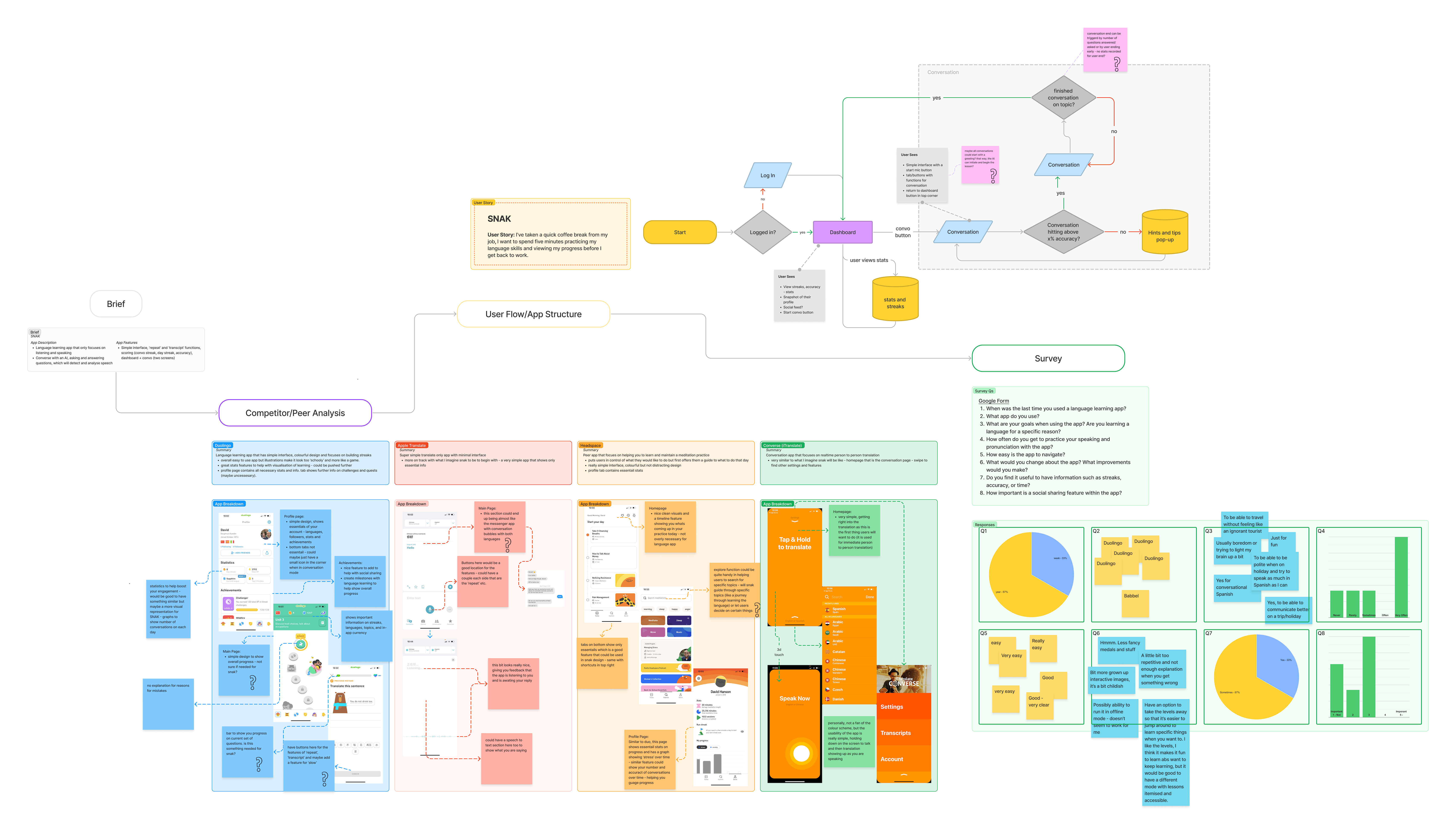
The first step in this project, as with every UX project, is research. The two methods employed were a competitive/peer analysis and a survey.

The objectives of the research were to find out the conventions with learning apps to make sure Snak felt familiar and easy to pick up.
Concept
The goals for the app were stated in the breif, with research however, these also had the addition of:
- simple and clean without being too colourful or childish
These goals work to create a smooth and intuitive flow for the user during their learning process.
Design
The first design step was to sketch low fidelity screens, to use as the fundamental concept.
After finding a layout that was simple and clean, the next step meant simple animations of the conversations, some more contextual copy, and plenty of annotations (for developer handoff). Making it ready for future iterative testing and refining.
Conclusion
The things I have learned
My first real world app design went pretty smoothly. This is the first iteration and is awaiting feedback but there are definitely things that need changing or altogether removing.
By jumping straight into the design stage, before spending time to properly analyse results of the research, has made my overall workflow longer and potentially a less effective app. I have learned that the UX process is, and needs to be, an iterative process with a strong foundation in research. Without knowing user goals, behaviours and context, there is no way to know if the app being made will even do well when launched!
As this project was made alongside my studies (see Mélamar Hotels Spec Case Study), I have learned that it is important to create a detailed journal of the project. This journal/document must contain well crafted notes as well as feedback, research objectives and goals; essentially all of the relevant information that could be easily read and presented. This will help not only myself but also help to communicate the process to team members and stakeholders (who may not be as involved in the project).
Next steps
My next steps would to adjust the design based on feedback before performing a number of usability tests on the current prototype. The results of which would determine further design, prototype, validate cycles to improve the quality and reduce/remove any pain points in my design.
Thanks for reading!
